Awaken Your Passion
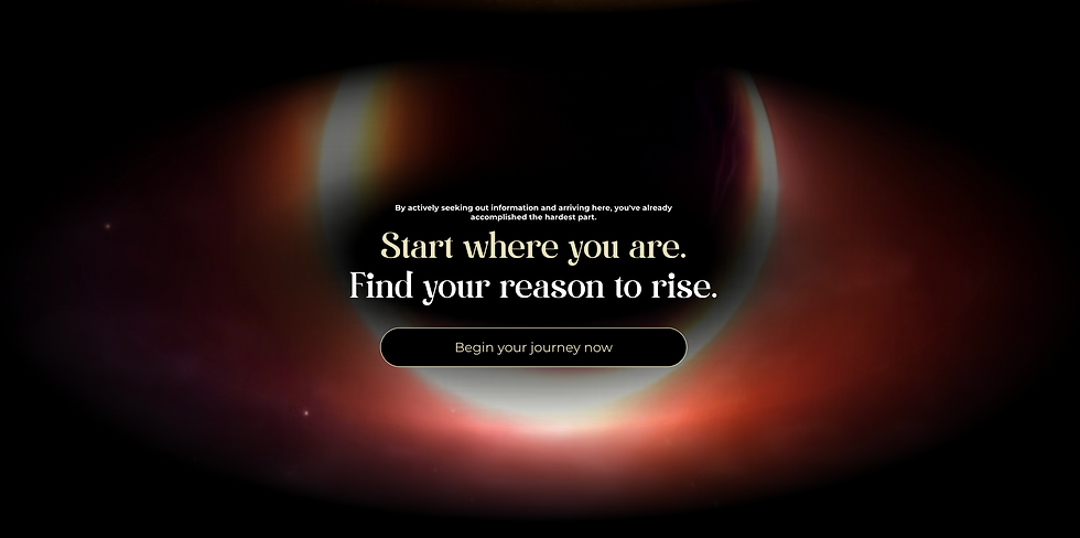
I designed the website for AYP (Awaken Your Passion), a platform dedicated to guiding individuals on their journey of self-discovery through meditation and purpose-driven living. The site was crafted to inspire tranquility and focus, creating a serene and intuitive user experience that aligns with the brand’s mission.


About the project
I had the privilege of designing the website for AYP (Awaken Your Passion), a platform dedicated to helping individuals explore meditation and uncover their true purpose. From the outset, my goal was to create not just a functional website but a holistic, immersive experience that reflects the transformative journey AYP offers its users.
The design focuses on fostering a sense of calm and clarity, with an intuitive layout that guides users through the platform’s offerings. I incorporated subtle visual elements and interactions to make the site feel like a personalized experience. Each design choice was intentional—soft colour palettes, smooth transitions, and calming animations were used to evoke the serenity associated with meditation.
To enhance this experiential aspect, I integrated features such as guided meditations, inspiring testimonials, and purpose-driven content flows that allow users to connect deeply with the platform’s mission. The navigation is streamlined, ensuring that users can easily explore resources and tools without feeling overwhelmed.
In designing this site, I aimed to create more than just a digital presence for AYP—I sought to provide a meaningful journey for every visitor, echoing the brand’s commitment to helping individuals awaken their passion and live with purpose.
Photoshop played a key role in refining the layout and visuals, allowing me to experiment with different mockups, adjust colour schemes, and create the necessary effects to highlight the product. I used layers to separate elements, ensuring smooth adjustments to every detail from the mouthpiece to the superhero branding. The software's tools were essential for applying texture effects, creating shadows for depth, and ensuring the designs were print-ready in high resolution.
A major part of the design process involved securing brand approval from Marvel. Given the strict guidelines and the need for consistency with Marvel’s established visual identity, every aspect of the packaging was meticulously reviewed. I worked closely with Marvel’s licensing team to ensure that the imagery, logos, and overall design complied with their branding standards. This included submitting multiple rounds of drafts, addressing feedback on colour accuracy, character representation, and proper logo usage, and ensuring all Marvel trademarks were correctly displayed. The approval process required constant communication and attention to detail, as the brand’s integrity had to be upheld while also showcasing the unique aspects of the fitness mouthpiece.
Ultimately, the packaging design was a careful balance of creativity and brand adherence, requiring expertise in Photoshop and a strong understanding of Marvel’s guidelines to deliver a product that not only appealed to the audience but also stayed true to the iconic brand.


